Stop me if you’ve heard this one before. You go to open a website on your mobile device and it takes one, two, three, four seconds to load. It feels like an eternity, and all you really wanted to do was make the most of a few minutes of spare time by reading an article you started earlier, checking the weather before heading to the beach, verifying whether the bus is still running, or some other simple online activity. You certainly didn’t want to spend four seconds waiting for a image to load on a screen.
This frustrating situation is unfortunately common, as many mobile websites are painfully slow to load. Not only does this have a negative effect on user experience, but it also has a negative impact on a site’s
search ranking
.
Indeed, while site slowness is an issue on all devices, the problem is more pronounced on mobile sites, due to a variety of issues. One of these reasons is
large image size
and it’s an issue we take very seriously at Duda. After all, isn’t it ridiculous that something designed to
attract
users may actually be driving them away?
We use a variety of strategies to ensure that the images you use in your responsive website enhance your user experience. We do this through techniques such as image resizing and compression, and the use of a Content Delivery Network (CDN), so that all images are delivered to all device types quickly, efficiently, and in just the right level of quality.
The Issue with Images
Before we get into
how
we ensure that images are delivered ideally for all devices, let’s first discuss
why
this needs to be done. First of all, while responsive design automatically handles the HTML and CSS of a URL on multiple devices, it doesn’t do anything with the images. So if you load an image that’s too big or too small for a certain device, a responsive website doesn’t necessarily resize it properly. This means that all the hard work that went into creating your beautiful website may be compromised by images that simply aren’t the right size.
Let’s take a look at hero images to illustrate the problem. Hero images are those big beautiful images that appear at the top of a homepage. They often take up the majority of real estate on a homepage, and are
a very important element in web design
.
Not only do hero images need to be awesome and effective, but they also need to be the right size. On desktop, this means they need to be large enough to look great (usually at least 600k wide). On mobile, however, if hero images are that big, they will take ages to load. As you can imagine, this results in a very poor user experience.
Of course, the need for appropriate image size applies to all images on your website – not just hero images. If you’ve got thumbnail images of your team on your website, you don’t need every wrinkle to be visible through high resolution. You just need the images to be large enough to look good on every device.
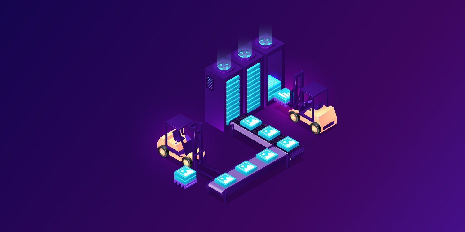
At Duda, we use a variety of techniques to ensure that all images are served in just the right size for each device type, so user always have the best possible experience. These are some of the the steps we take to make sure all that happens.
Resizing Images for Optimal Size
First and foremost, all images loaded to Duda go through an automatic, behind-the-scenes image resizing process. This means you don’t need to think twice about the size of the images you load, and you don’t need to consider how those images will be served to different devices. You can load virtually any type of image and it will automatically be resized using
imagemagick
, a software suite that resizes a variety of image formats. If a URL request comes from a mobile site, every image that’s delivered to that site will automatically be served in a smaller format than if the same request comes from a desktop site.
Lossy Compression For Maximum Reduction
Most images loaded to the Duda platform are JPEG and PNG; in addition to resizing these images with imagemagick, we also compress them. The tools we use to compress these images use a process called
lossy compression
. Lossy compression reduces image size by rewriting a file’s data to become more efficient. Lossy compression eliminates redundant data and unnecessary information, and can enable file size reduction by up to 80%.
While the quality of the reduced file changes slightly in lossy compression, the effect is hard to notice, especially considering the small size of images served on mobile devices. So, while you may not want to print an image that’s been compressed using lossy compression and hang it on your wall, there’s absolutely no reason not to compress an image with lossy compression and then deliver it to a mobile screen. The quality loss will hardly be noticeable, and the reduction in size makes delivery noticeably faster.
Multiple Servers for Optimal Speed
Another technique we use to ensure that images are loaded as quickly as possible is CDN, which stands for Content Delivery Network. CDN is a system that delivers web content according to the geographic location of the user. We use the
Amazon Cloudfront CDN
, which enables us to store original versions of images on multiple servers worldwide. Amazon’s CDN has more than 35 servers around the world. This vast network means that content can be delivered from the best location according to the geolocation of the device that’s calling it. Once a piece of content has been delivered from a specific server, a copy of it is stored on that server, so the next time there’s a request for that same image in that location, the image is already located in the closest possible server.
The Need for Speed
Optimizing image delivery is a critical step in improving
mobile page speed
, and when you think about how much time you invested in choosing those images, it only seems right that they be loaded optimally. Furthermore, after all the effort you spent choosing the right template, picking the right colors, and adding the right buttons for your website, wouldn’t it be a shame if your website’s weakest element were images that weren’t properly sized?